 The United States health care system is a big, expensive mess, and the people working in the system today often don’t even know how to start learning about the system, and it’s problems. My own frustration with the health care system – and lack of teaching about it during medical school – lead me to write The Health Care Handbook: A Clear and Concise Guide to the US Health Care System with my colleague Elisabeth Askin. The goal was to create an understandable primer on the health care system for providers so that we can all work together to improve the system and help our patients.
We have partnered with THCB to provide excerpts from the 2nd edition of the Handbook, which will provide background and insight on important health care issues that we face today. We would love your questions, comments and feedback. Today’s excerpt provides a brief overview of the state of the US health care system today.
Cost
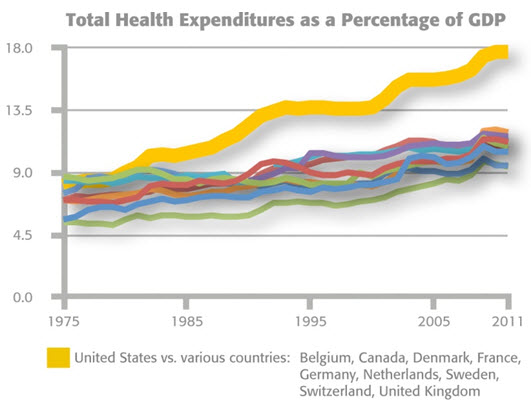
The U.S. currently spends more than 17% of its national gross domestic product (GDP) on health care, far more than any other country in the world. Health care spending now averages almost $9,000 per American,1and health care is the fastest growing industry in the country.2Private (nongovernmental)health care spending accounts for a large portion of the difference between spending in the U.S. and in other industrialized countries.
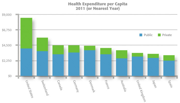 Organisation for Economic Co-operation and Development, “Health Statistics2013,” June 2013. Note: Values in U.S. $ Purchasing Power Parity. Data for Japan and Australia refers to 2008.
Access
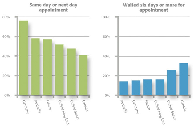
The U.S. has fewer physicians,hospital beds, physician visits,and hospitalizations per capita than most other industrialized countries.3 Eighty-five percent of Americans report having a regular source of ongoing care, but more than a quarter encounter difficulty accessing the healthcare system.4 There are large disparities in access by type of health insurance coverage.
Agency for Healthcare Research and Quality, “2012 National Healthcare Quality and Disparities Reports,” June 2013. Note: Health insurance status refers to those 18–64 years old. Poor refers to household incomes below the federal poverty level (FPL); low income, 100–200% FPL; middle, 200–399% FPL; high, more than 400% FPL.
The Commonwealth Fund, “2013 International Health Policy Survey in Eleven Countries,”Nov. 2013. Used with permission.
Quality
Despite spending all that money, we don’t have the highest quality health system.Americans only receive about 55–70% of recommended care they need,4,5and huge disparities exist in health outcomes by insurance status, race, income,and location.6 Life expectancy is rising, but not as fast as in other industrialized countries. The U.S. ranks poorly for infant and maternal mortality, preventive care, and chronic disease care. On the bright side, we’re near the front of the pack in cancer care, medical research and education, and diagnostic imaging.3
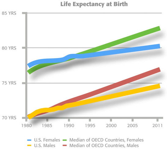 Organisation for Economic Co-operation and Development, “Health Statistics 2013,” June 2013.
  Organisation for Economic Co-operation and Development, “Health Statistics 2011,” June 2011. Note: Data from 2009, or nearest year.
Organisation for Economic Co-operation and Development,“Health Statistics 2013,” June 2013.Other Countries noted here include:Australia, Austria, Belgium, Canada, Chile,Czech Rep., Denmark, Finland, France,Germany, Greece, Iceland, Ireland, Israel,Italy, Japan, Korea, Luxembourg, Netherlands,New Zealand, Norway, Poland, Portugal,Slovak Rep., Slovenia, Spain, Sweden,Switzerland, United Kingdom. Data for Japan and Australia refers to 2008.Note: Values in U.S. $ Purchasing Power Parity.
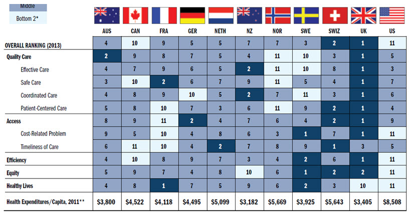
Any way you slice it, the U.S. health care system is in trouble. The most recent major international comparison by the Commonwealth Fund ranked our system 11th—which isn’t so bad until you realize that the study only included eleven countries.
Davis, et al., “Mirror, Mirror on the Wall, 2014 Update: How the U.S. Health Care System Compares Internationally,”The Commonwealth Fund,June 2010. Used with permission.
1 NHE Fact Sheet. www.cms.gov/Research-Statistics-Data-and-Systems/Statistics-Trendsand Reports/NationalHealthExpendData/NHE-Fact-Sheet.html. Accessed July 8, 2014.
2 Moses H, Matheson D, et al. The Anatomy of Health Care in the United States. JAMA: The Journal of the American Medical Association. 2013;310(18):1947-1964.
3 David S. The U.S. Health System in Perspective: A Comparison of Twelve Industrialized Nations. www.commonwealthfund.org/~/media/Files/Publications/Issue%20Brief/2011/Jul/1532_Squires_US_hlt_sys_comparison_12_nations_intl_brief_v2.pdf. Accessed July 21, 2014.
4 2012 National Healthcare Quality Report. www.ahrq.gov/research/findings/nhqrdr/nhqr12. Accessed July 21, 2014.
5 Asch SM, Kerr EA, et al. Who Is at Greatest Risk for Receiving Poor-Quality Health Care? New England Journal of Medicine. 2006;354(11):1147-1156.
6 2012 National Healthcare Disparities Report.nhqrnet.ahrq.gov/inhqrdr/reports/nhdr. Accessed July 21, 2014.
Categories: Uncategorized







Paul, thanks for your comments on our excerpt. It’s true that patient lifestyles make it hard to tease out the effects of the health care system alone. However, most measures of the US health care system indicate that our lifestyles as well as our system rank poorly. You may be familiar with “Mortality Amenable to Health Care”, an alternate to life expectancy in which the US also ranks near the bottom of industrialized countries.
No, I think they will say:
“Look, this insurance thing failed, we need single payer.”
One might think life expectancy and infant mortality rates are good indications of the quality of country health care systems. Unfortunately, this is definitely not the case.
Variations in data collection practices in different countries on these measures introduce one source of error in using these as proxies for health system effectiveness. Another is the fact that country variation in smoking rates and mortality from things unrelated to health care quality (think things like country variations in gun deaths and accident rates of young). Once one controls for such things, the US health care system looks much much better….maybe even the best in the world.
I agree with Dr. Palmer’s comment: “after all this effort using our finest minds in policy, in academia, and in government and spending all this money, that we might be getting a worse system. ” …..it appears none of the ACA nostrums have any indication of improvement. The proponents will simply say be patient and give us a few hundred billion more to spend each year.
What is the incremental slope–the derivative if you will–of the worth of the US healthcare system 5.8 years after the passage of the PPACA? Are we getting a little better or a little worse?
It is rather poignant to think that, after all this effort using our finest minds in policy, in academia, and in government and spending all this money, that we might be getting a worse system.
If the slope is indeed negative, then this result is more than a failure. It is a catastrophe. It calls for an upheaval in our next approach. After all, the ACA tried every nostrum and shibboleth in access, quality and cost improvement that could be imagined. What remains?